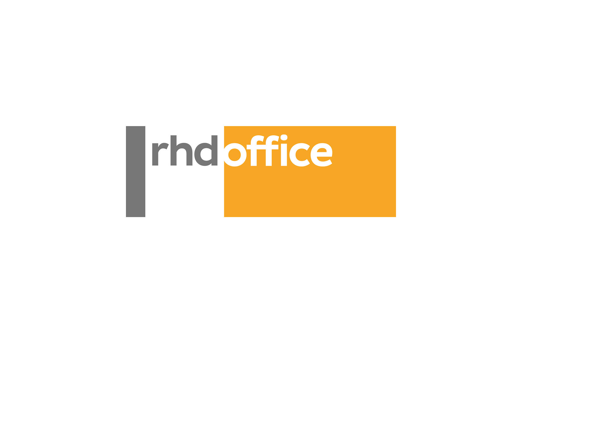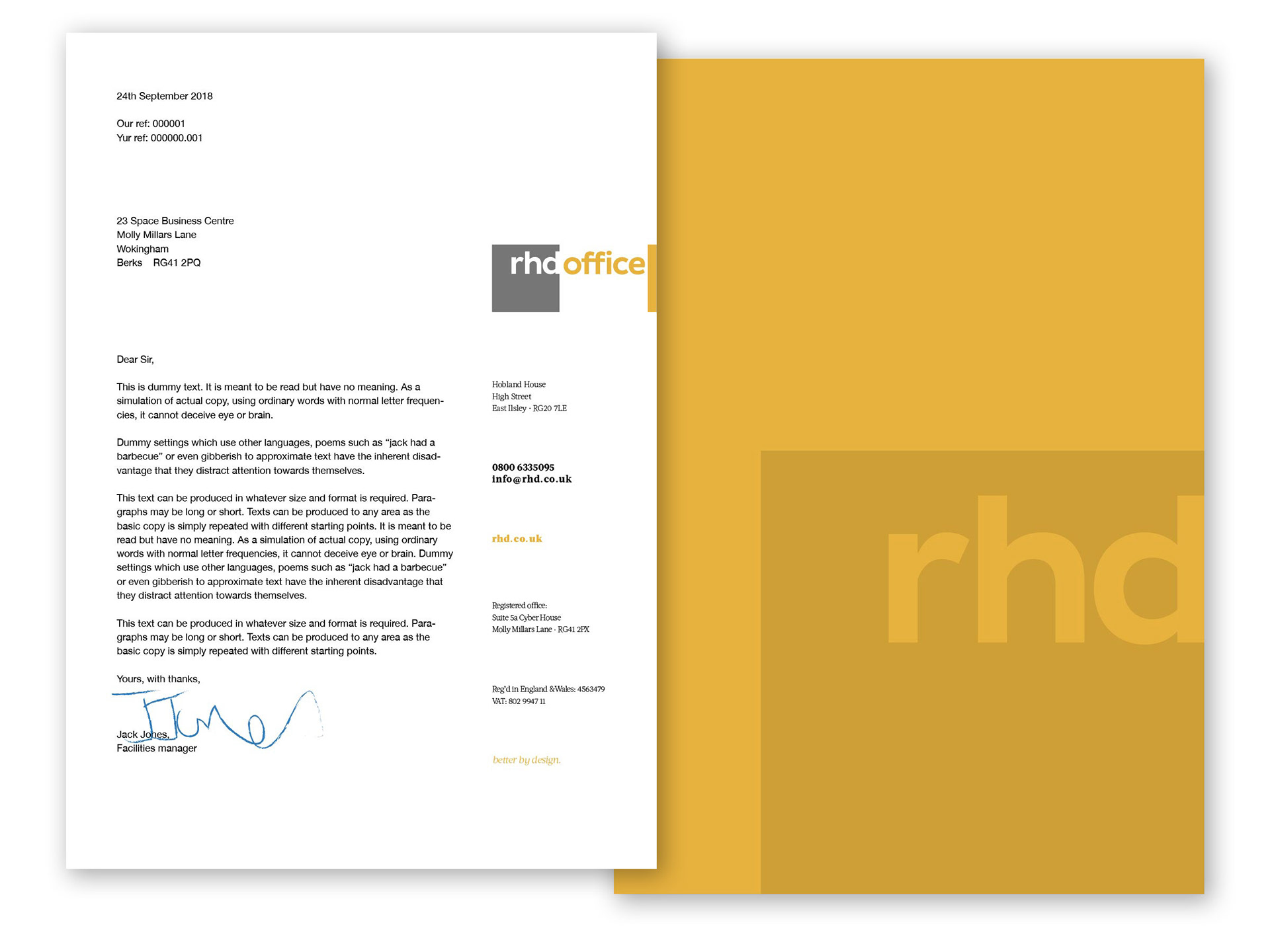
The client is a designer of interior spaces and has an acute awareness of best use of space. A refurb of his existing logo was required, along with designs for stationery and business cards. We thought it important to keep the essence of the old identity in order to maximise its strength and already-established presence. Colours were updated, the logo simplified and a change of emphasis added.
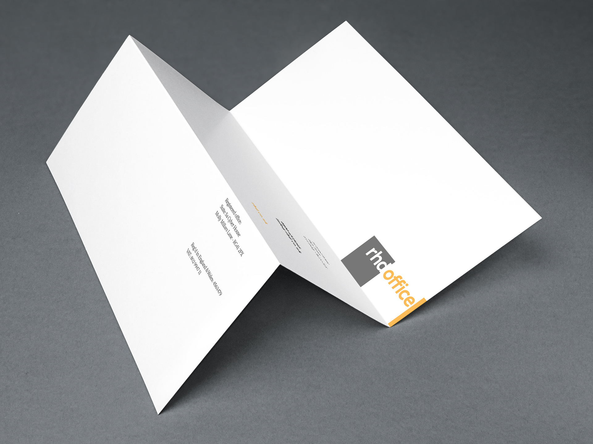
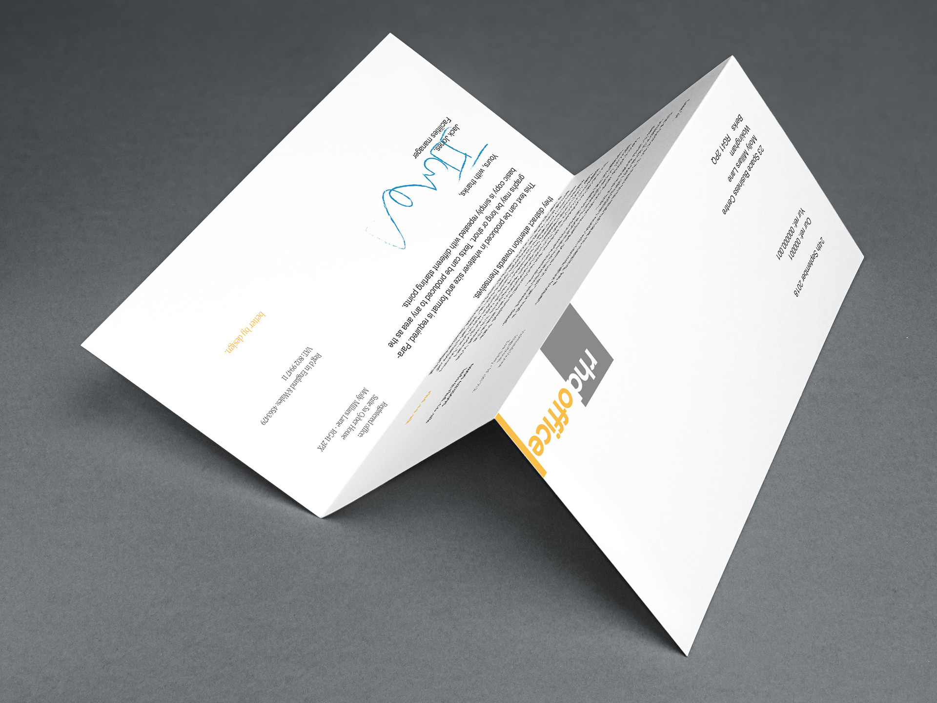
The stationery design was updated and modernised in a way that maintained legibility and made an aesthetic yet eminently practical layout of details.